Livingston, Montana City Rebrand
Livingston, Montana began as historic railroad city on the Yellowstone River, surrounded by the full majesty of mother nature and the Rocky Mountains. The city has a number of popular tourist attractions, and boldly set on a rebranding project to modernize and revitalize the area. This case study showcases the process and results of this effort, highlighting the key elements of design, the challenges faced, and the impact the city’s new brand has had on the community. This case study provides a detailed glimpse at the entirety of the rebranding process.
The old Livingston logo, while charming, lacks scalability — making it difficult to see on smaller devices. The new logo accounts for this issue, making it nimble and easy to use in all future applications. It combines rugged mountains, beautiful forests, and the Yellowstone river into a majestic new personality. We strive to include a majestic and adventurous vibe to represent the community.
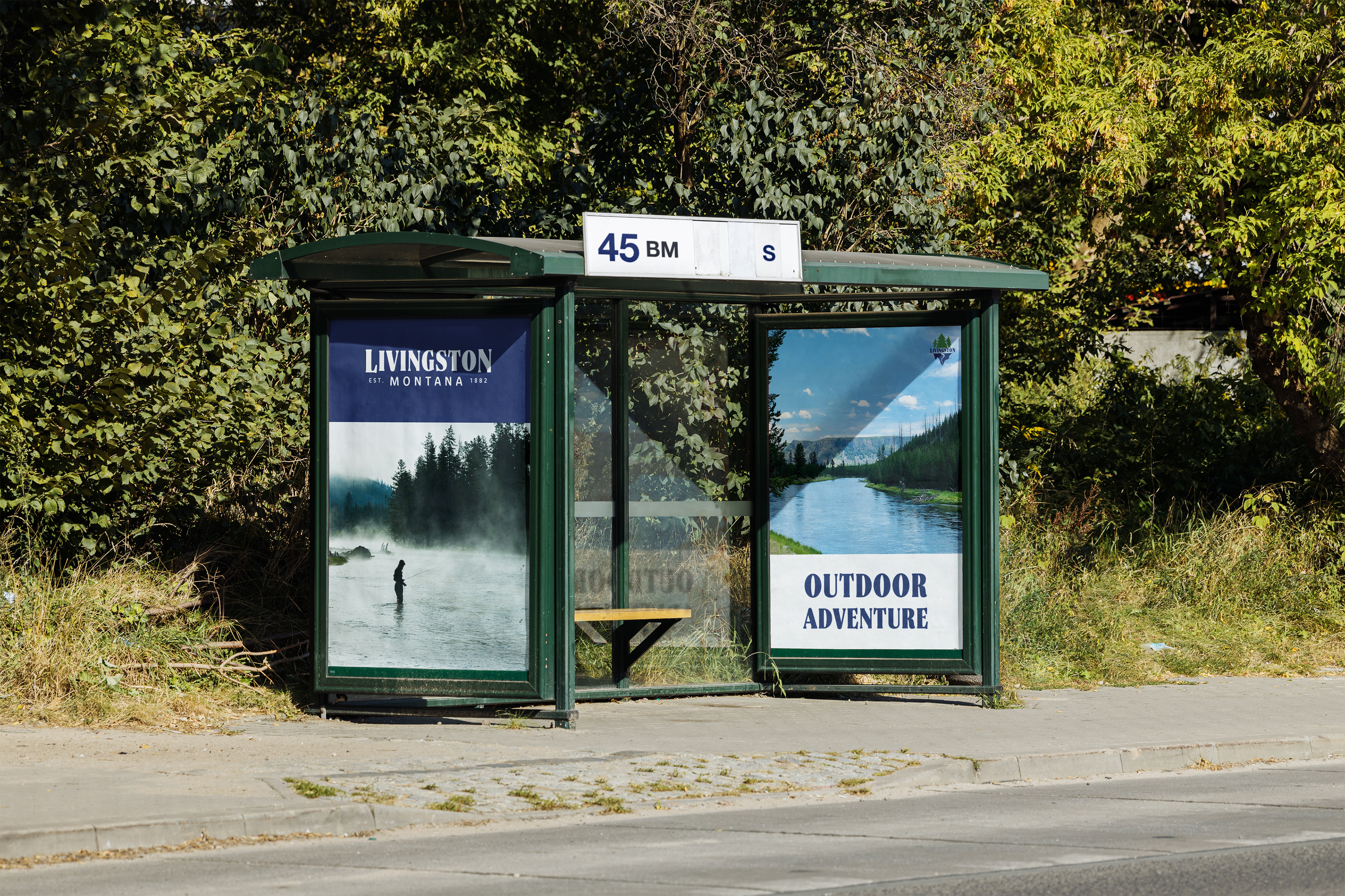
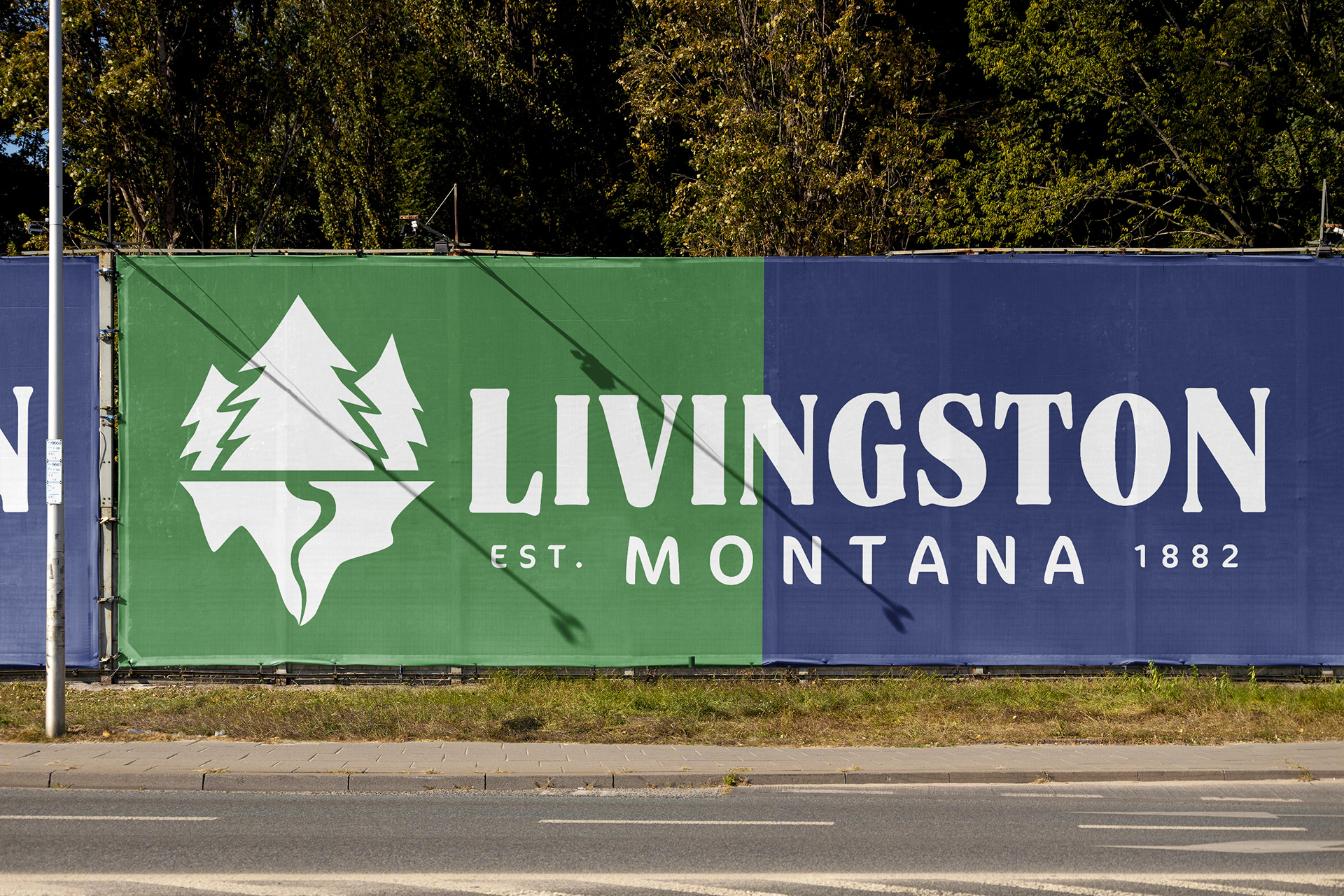
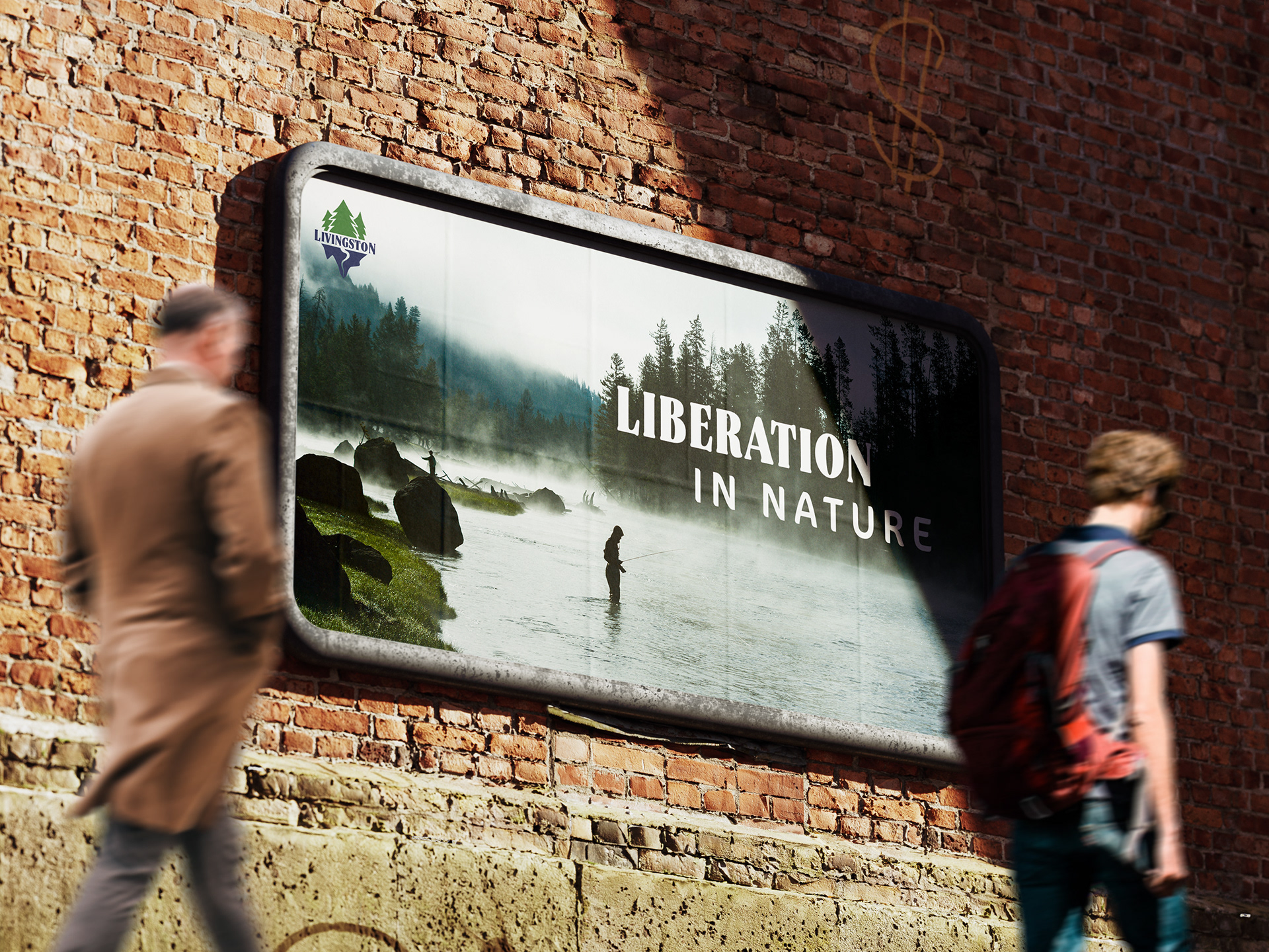
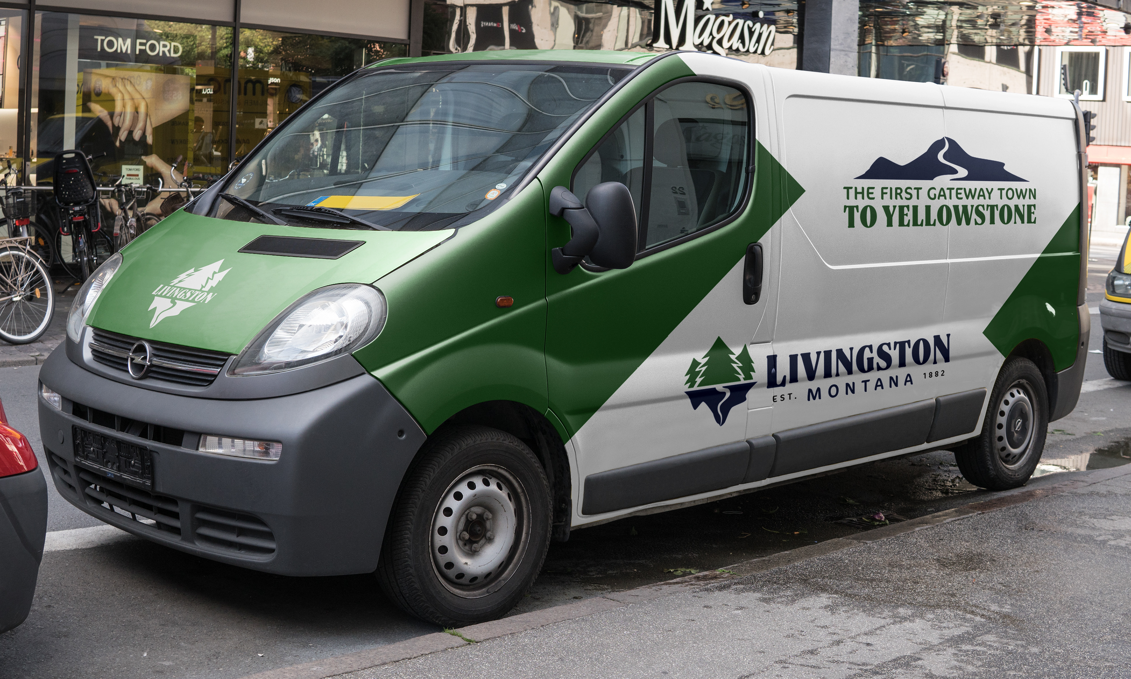

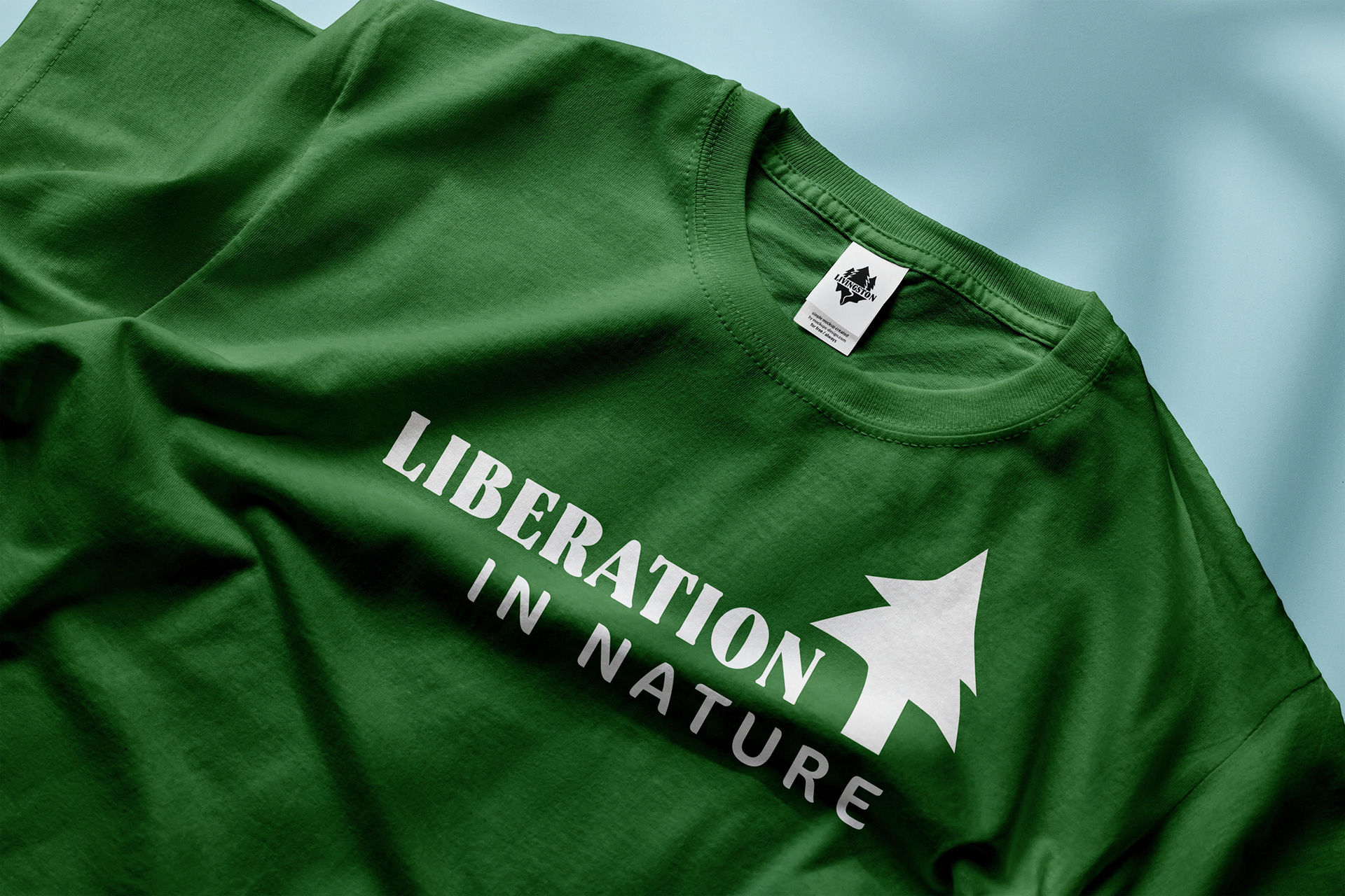


The logo redesign and rebrand launches Livingston into contemporary times while maintaining the natural feel. The logo is charming, scaleable, and usable for a variety of applications. This project presented a unique challenge, but the outcome is a design that flawlessly embodies the spirit of this majestic city.


